GETTING STARTED
Jamie Ellul
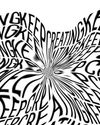
This project began when the digital whizz-kids at Mud won the pitch to design the new Grant Associates website. We share a building with Mud as well as the visual effects studio Fitzroy Hawk, which also works for Grant Associates. Mud’s discussions with the clients identified the need for a new identity and we came on board to develop that, while Fitzroy Hawk created some stunning animations in conjunction with the new brand.
To add to the coincidence, Grant Associates, a global landscape architecture practice, used to occupy the building our three companies are in. I think they liked knowing that we’re all under the same roof, and although they might have felt strange coming back to their old space at least they didn’t need to ask where the toilets are.
We met the directors and associates to understand how they work and what makes them unique, and put together an expansive competitor audit looking at visual identity, web design and tone of voice in their category. Our first recommendation to clients is always to create difference. The trend in the sector is towards sans serif all cap logotypes, dark colours and clean, white websites. We suggested an approach that’s opposite to all of this.
The new positioning statement for the brand is, “We reveal the wonders of the natural world in order to reconnect people and nature.” This gets across their commitment to using creative ecology in urban environments, reminding people that the natural and man-made can exist harmoniously.
DESIGNING THE IDENTITY
Jamie Ellul
This story is from the May 2020 edition of Computer Arts - UK.
Start your 7-day Magzter GOLD free trial to access thousands of curated premium stories, and 9,000+ magazines and newspapers.
Already a subscriber ? Sign In
This story is from the May 2020 edition of Computer Arts - UK.
Start your 7-day Magzter GOLD free trial to access thousands of curated premium stories, and 9,000+ magazines and newspapers.
Already a subscriber? Sign In
Creative Space
Without’s creative director roly grant on the studio’s hand-crafted ethos
studio profile
A leading light in the branding industry, Wolff Olins wants to harness its scale to help change the world

network
THE CREATIVE COMMUNITY HAS COME TOGETHER LIKE NEVER BEFORE, TO HELP EACH OTHER GET THROUGH THE CORONAVIRUS PANDEMIC

project
ethos for 305 Fitness - Learn how the Montreal identity design studio rebranded one of America’s hottest fitness clubs

rebrand
WHAT’S THE EXPERT OPINION ON PENTAGRAM’S BRAND IDENTITY REFRESH OF THE GLOBAL TOY COMPANY FISHER-PRICE?
opinion
CRAIG BLACK HAS SOME ADVICE FOR SURVIVING THE CORONAVIRUS CRISIS AS AN INDEPENDENT CREATIVE

fresh eyes
DUNCAN BRAZZIL ON HOW THE UK INSPIRED HIS CAREER

artist insight
Cindy Kang on how photography informs her illustration work
ANIMATION NOW
LEADING PRODUCERS AND FILMMAKERS REFLECT ON EMERGING TRENDS AND SHARE THEIR PREDICTIONS FOR THE YEAR AHEAD
Project: Atoll by Studio Myerscough
Morag Myerscough reveals how she and Luke Morgan designed a vibrant biophilic installation in a central London office tower studiomyerscough.com