
TEXTILE DESIGNER LORI WEITZNER HAS A unique window into how Covid changed our relationship with color. For her 2016 book, Ode to Color, Weitzner identified 10 essential palettes and then teamed up with a psychologist to develop an 18-question quiz (offered on her website) that helps readers figure out which palettes suit them best. Questions touch on everything from preferred genres of books, music, and movies to one's tolerance for risk-taking and sentimentality.
Before the pandemic, the quiz results reflected a need for creativity, connection with nature, and relaxation, with the Alchemy, Fragrant Woods, and At Ease palettes as its most frequent outcomes-fitting for a go-go-go world. Then, starting in 2020, Weitzner noticed a change in the data: “Waterside is by far the most up,” she says. “It's about feeling grounded in a world that is disrupted, about creating a world for yourself with no surprises or shocks. And Earthly is about people discovering their passions and following through on their dreams.” It's little surprise: As our homes become the epicenter of our lives, what we need from them-aesthetically and emotionally-is more important than ever.
Find yourself in one of Weitzner's 10 palettes, then decorate accordingly. “Start to think of color as a tool," she: says, "and come up with your own color worlds.”
Romantic
Rust, clay, aubergine. The rich, exuberant colors of Earthly remind us to follow our passions-fitting coming off the stagnation caused by pandemic lockdowns. “I always say that you can smile through life or you can sing through life. Earthly inspires you to sing," says Weitzner. At home, she recommends incorporating terra-cotta pots or simply "starting by lighting a candle."
Escapist
This story is from the April - May 2022 edition of House Beautiful.
Start your 7-day Magzter GOLD free trial to access thousands of curated premium stories, and 9,000+ magazines and newspapers.
Already a subscriber ? Sign In
This story is from the April - May 2022 edition of House Beautiful.
Start your 7-day Magzter GOLD free trial to access thousands of curated premium stories, and 9,000+ magazines and newspapers.
Already a subscriber? Sign In
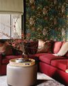
A Change of Direction
The goal was a \"bright and airy\" vacation home, but one designer knew the homeowner's request for all-white everything wasn't the only way to get there.

Hold the Line
Big choices can feel totally elegant-as one designer proves. Just stick to a restrained color palette and then don't hold back.
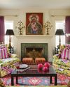
JOY COMES FIRST
When happiness gets prioritized above resale value, you decorate fearlessly. It's how one homeowner brought this charming San Antonio cottage back to life.
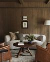
Quiet Time
Warm tones and natural textures took this Indiana home from cavernous to cozy.
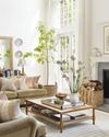
Charmed, I'm Sure
What happens when a free-spirited attitude meets a classic sensibility? In this Long Island house, it's the perfect match
For the LOVE of HOME
Our annual Whole Home project has always been a celebration of how meaningful design can create a safe haven from the chaos of the world around us. Never has that mission been more important.

The Bold & The Beautiful
A Georgian-style estate swaps fussy formality for rich colors, plentiful patterns, and functionality reflective of family life.

French Dressing
Can you really turn a big Texas home into a charming Francophile retreat? Oui, oui.

Tailor Made
In a competitive real estate market, a couple decides against house hunting and goes all in on a custom build in the heart of Dallas.

One Foot in the Sand
A whimsical space blends island style with classic details and references to the past.