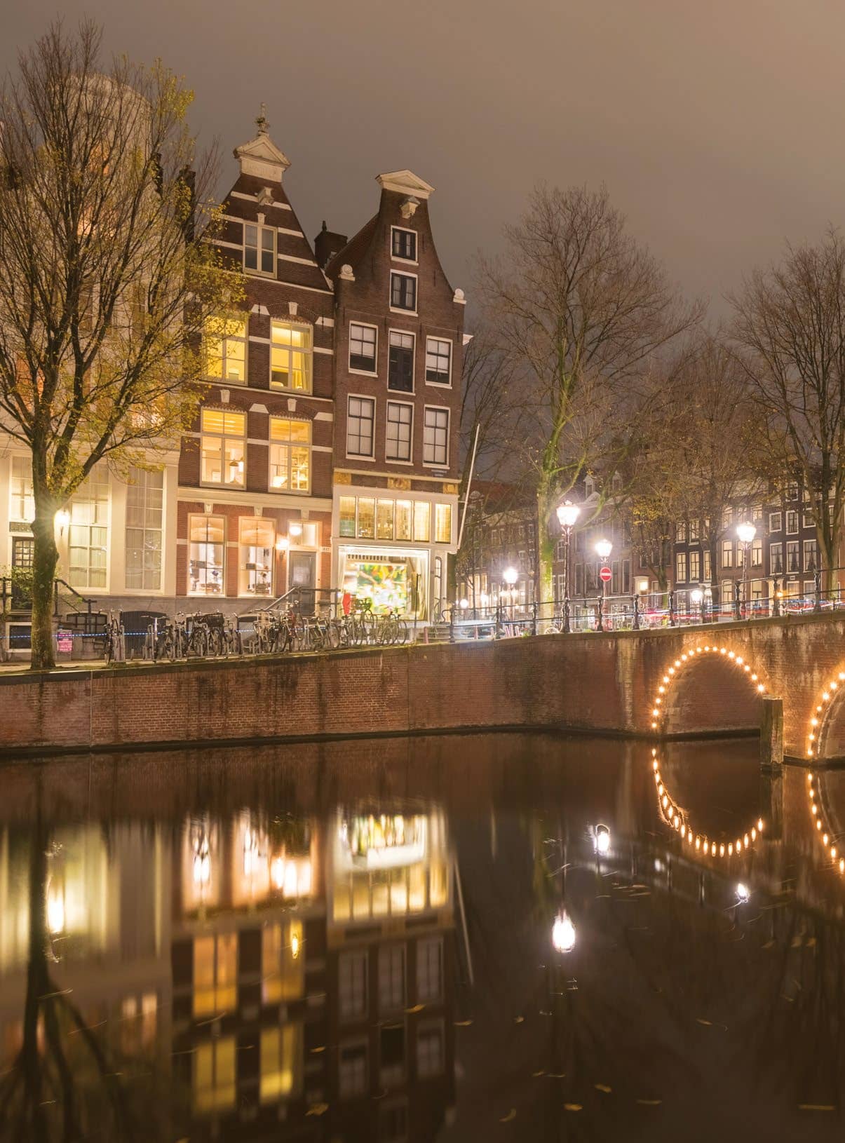
There are several ways to convert to mono in Affinity Photo, but the two most useful methods both offer crucial control over the brightness of different colours during the conversion.
One of these is the Black & White adjustment layer, which is found within the Photo Persona. The other is the Black & White panel within the Develop Persona. Both offer a set of colour sliders that let you tune the look of black and white by, say, darkening a blue sky or lightening foliage. We’ve used the Develop Persona (can be used for Raws and JPEGs). The controls allow us to lower the brightness of the blown-out lights in the scene, revealing detail and balancing out tones.
Converting to mono is often only the starting point for other edits. Initially, black-and-white images can look a little flat, so we’ll go on to boost contrast here with Curves. Black-and-white images also offer the chance for selective lightening and darkening (often to a greater degree than the coloured one), so we can dodge and burn parts of the scene to balance the dark foreground with the brighter sky. We do this using the Develop Persona’s Overlays – the best tool for selective adjustments. Finally, we can add a colour toning effect. We created a warm tone using the Develop Persona’s Split Toning controls.
This story is from the March 2020 edition of PhotoPlus : The Canon Magazine.
Start your 7-day Magzter GOLD free trial to access thousands of curated premium stories, and 9,000+ magazines and newspapers.
Already a subscriber ? Sign In
This story is from the March 2020 edition of PhotoPlus : The Canon Magazine.
Start your 7-day Magzter GOLD free trial to access thousands of curated premium stories, and 9,000+ magazines and newspapers.
Already a subscriber? Sign In
The Art of Copying Art - James Paterson shows you how to use your Canon gear to capture artwork and paintings the right way with simple camera and lighting skills
Whether you want to capture a painting like the above, digitise old prints or reproduce any kind of canvas, there's real skill in capturing artwork with your camera. Not only do you need the colours to be accurate, you also need to master the spread, angle and quality of the light to minimise glare and show the work at its best.This painting by the artist Bryan Hanlon has a wonderfully subtle colour palette. To reproduce the painting in print and digital form, it needs to be captured in the right way.

Fright night
Canon photographer and digital artist Alexander loves to craft incredible fantasy scenes with a spooky horror twist

Sharpen your shots with DPP
Sharpening a digital image also increases contrast at the edge of details

CANON ImagePrograf PRO-1100
Deeper blacks, better bronzing, greater lifespan and 5G Wi-Fi -Canon's new printer is full of new tech, says
Canon's new 'kit lens' is actually a half-price f/2.8 trinity lens!
The Canon RF 28-70mm F2.8 IS STM lacks a red ring, but borrows premium features from its L-series siblings

DREW GIBSON
Pro motorsports photographer Drew on why he hasn't (yet) switched to Canon's mirrorless system, why old-school techniques can be the most reliable, and the lessons learned from more than a decade shooting the world's biggest car brands

Up in smoke
Make a smoky shape in Affinity Photo and get to grips with the amazing Liquify Persona under the guidance of James Paterson

Expand your creativity with Generative Fill
Photoshop's Al-powered feature brings revolutionary new tools to image editing. James Paterson reveals all...
Turn your images into vintage postcards
Wish you were here? Sean McCormack explains how you can give your summer photographs a vintage postcard look

The Angel Malibu
Light painting an American movie producer in the Wadi Rum Desert in Jordan was a highly unlikely evening out for David!